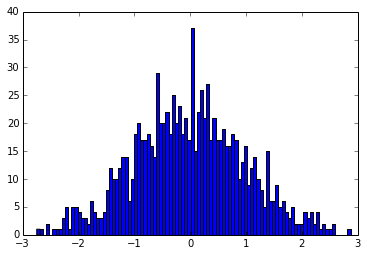
The Jacknife is also sometimes called the “Leave One Out” method, and is a method to somehow evaluate the stability of statistics done on data. By leaving one element out of the input array and studying the mean of the…
Thomas Lecocq @ the Royal Observatory of Belgium
The Jacknife is also sometimes called the “Leave One Out” method, and is a method to somehow evaluate the stability of statistics done on data. By leaving one element out of the input array and studying the mean of the…
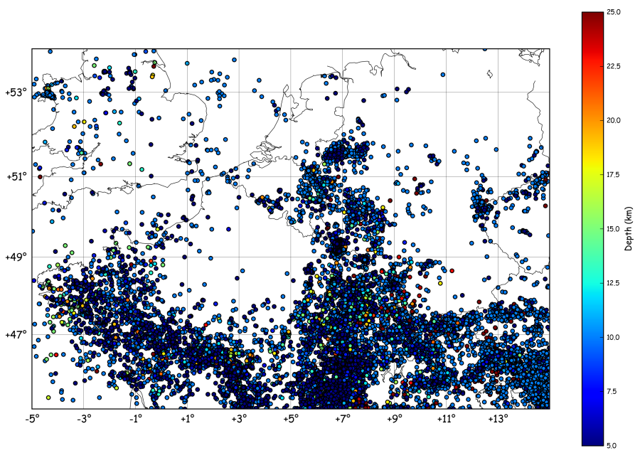
Imagine we want to plot a map of the seismic activity in NW-Europe and, at the same time, count the number events per month. To get a catalogue of earthquakes in the region, one can call the NEIC (note: this…
To extend the previous tutorial (see here), we define a data array that has some information about the event that occurred for each datetime. The plot of data vs time now looks like: The data array is constructed with numpy.random:…
To add some interesting information to the previous tutorial, I’ve downloaded the number of licence plates given for new cars in Belgium for the same time span: 2005 587764 2006 633570 2007 644313 2008 652590 2009 571001 2010 642086 2011…
Anyone who has played a little with dates know how painful it can be… Even more when you want to plot this data !! Matplotlib provides (link) a dates API, but to be honnest, even if the documentation is well…
Here is a new tutorial that will include “a bit of all” tutorials previously published on this blog and some new cool stuff to play with ! Idea: Find some resources on the Internet and plot them on the map…