Following a question from my dear colleague Devy, here is how to plot a set of events, occurring at random moments in time. The idea is to plot the waveform of each event with the beginning at the top and…
Thomas Lecocq @ the Royal Observatory of Belgium
Following a question from my dear colleague Devy, here is how to plot a set of events, occurring at random moments in time. The idea is to plot the waveform of each event with the beginning at the top and…
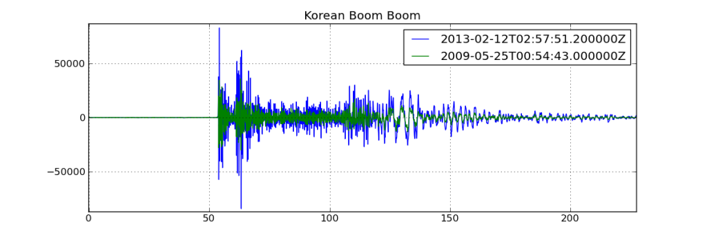
This morning, North Korea tested some nuclear “bomb” somewhere in the middle of the country (confirmed by Pyongyang officials and CTBTO), and many seismic sensors worldwide recorded the triggered waveforms. The location of the test is the same as the…
In the coming months, I’ll prepare some tutorials over an excellent data analysis package called pandas ! To show you the power of pandas, just take a look at this old tutorial, where I exploited the power of itertools to…
While in Indonesia last July, I created a small tool for the Kawah Ijen observers to allow them to search and plot teleseismic events and to calculate theoretical arrival times of the waves at the Ijen stations. It took roughly…
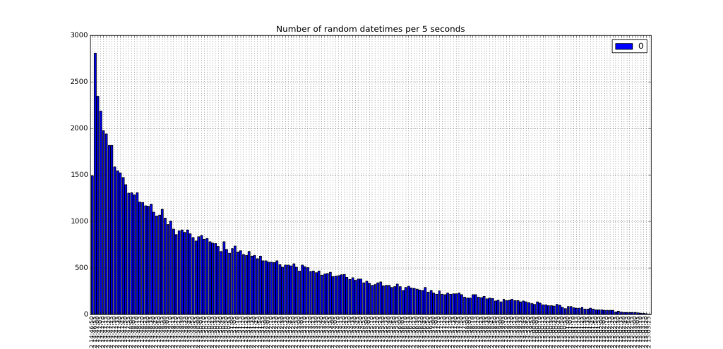
To extend the previous tutorial (see here), we define a data array that has some information about the event that occurred for each datetime. The plot of data vs time now looks like: The data array is constructed with numpy.random:…
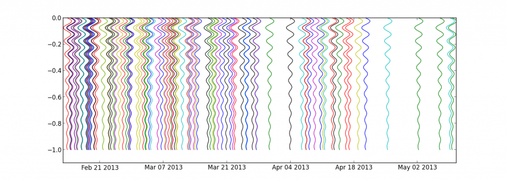
New tutorial, more advanced this time ! Let’s say we have a number of observations, like occurrences of earthquakes, or visitors connecting to a webserver, etc. These observations don’t occur every second, they are sparse on the time axis. To…
To add some interesting information to the previous tutorial, I’ve downloaded the number of licence plates given for new cars in Belgium for the same time span: 2005 587764 2006 633570 2007 644313 2008 652590 2009 571001 2010 642086 2011…
Anyone who has played a little with dates know how painful it can be… Even more when you want to plot this data !! Matplotlib provides (link) a dates API, but to be honnest, even if the documentation is well…
Following a very old post (link), and questions from Matthias and Kevin, I’ve finally managed to test the R2-related scripts I wrote long-long time ago… I’m really sorry, but don’t quite have the time now to really document all functions/actions,…
Everyone used to search for code snippets on the web know the importance of a “Gallery” linking to all examples and tutorials… So, here is my really ugly Gallery :
In the previous tutorial, I defined a “shoot” method to compute the landing point of a shoot from one point, to a given azimuth and distance. Using this logic, it’s possible to find the points situated at a given distance…
Following a question from Ricardo Gama (see his comment), I’ve prepared this new tutorial. He wondered if Basemap has a function similar to the track1 function in matlab (you know, that crappy costly thing…)… Here is what I obtained :…
Dear visitors, I’m always searching new ideas of preparing new tutorials for things doable with Basemap, but I’d like these examples to be as useful as possible, which means : If you have something you would like to appear here,…
New version here Following a question in the matplotlib mailing list, I dug inside the code of readshapefile, in order to gain power : The goal: The data: http://www.gadm.org/ saved inside a new “borders/” folder ! The idea: Opening a…
Here is the trick (well documented on the matplotlib webpage) to define the font family and size of what appears on your matplotlib plot:
Here is a new tutorial that will include “a bit of all” tutorials previously published on this blog and some new cool stuff to play with ! Idea: Find some resources on the Internet and plot them on the map…
Hi folkes, Following a question by Gui on this website, I checked the “how to” draw pie charts on a basemap plot ! Here below I generalise the example given by Manuel Metz on the matplotlib website. The idea is…
# remember to define the ax instance : ax = plt.subplot(111) zone = “Roetgen – Monschau” x,y = m(6.15,50.41) x2,y2 = m(6.59,50.67) x3,y3 = m(6.34,50.855) x4,y4 = m(5.83,50.65) data = np.array(([x,x2,x3,x4], [y,y2,y3,y4])) p = Polygon(data.T,edgecolor=’red’,linewidth=1.5,facecolor=’none’) ax.add_artist(p) Note that we have…
Here, we will focus on adding a “zoom box” on the top left corner of the plot. But before that, we will mask a part of the earthquakes, in order to have a “cleaner” map ! This is achieved by…
Now, let’s imagine we have a dataset containing latitude/longitudes of earthquakes, plus their depth and magnitude. Of course, you don’t always have this dataset available, so let’s build a fake one : import numpy as np lon = np.random.random_integers(11,79,1000)/10. lat…
# # BaseMap example by geophysique.be # tutorial 01 from mpl_toolkits.basemap import Basemap import matplotlib.pyplot as plt import numpy as np fig = plt.figure(figsize=(11.7,8.3)) #Custom adjust of the subplots plt.subplots_adjust(left=0.05,right=0.95,top=0.90,bottom=0.05,wspace=0.15,hspace=0.05) ax = plt.subplot(111) #Let’s create a basemap around Belgium m…
I just discovered that I was using from griddata import griddata in quite a lot of python scripts I wrote for scientific data plotting. While struggling to recompile it under my new win7 x64 box, I googled a little and…