Hi folkes,
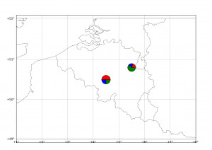
Following a question by Gui on this website, I checked the “how to” draw pie charts on a basemap plot !
Here below I generalise the example given by Manuel Metz on the matplotlib website.
The idea is to draw a pie from scratch, in a method that allows a custom number of parts to be set. Each part of the pie is drawn as a scatter point with a custom marker (wedge). In the following example, the ratios list is provided to the draw_pie method. X and Y are the coordinates of the center of the pie, size is … the size of the pie chart.
The draw_pie method draws the pie part after part. The first part is drawn from 0.0 to 2*pi*ratios[0], the second between 2*pi*ratios[0] to 2*pi*ratios[0]+2*pi*ratios[1], and so on until 2*pi is reached. I don’t, for this example, verify that the sum of ratios is 1.0. The colors of the parts are defined in the colors property (6 values here, can be expanded).
#
# BaseMap example by geophysique.be
# tutorial 05

"""
Using :
-- An example makes custom 'pie charts' as the markers for a scatter plot
-- Thanks to Manuel Metz for the example
"""
import math
import numpy as np
import matplotlib.pyplot as plt
from mpl_toolkits.basemap import Basemap

colors = ['red','blue','green','yellow','magenta','purple']

def draw_pie(ax,ratios=[0.4,0.3,0.3], X=0, Y=0, size = 1000):
    N = len(ratios)

    xy = []

    start = 0.
    for ratio in ratios:
        x = [0] + np.cos(np.linspace(2*math.pi*start,2*math.pi*(start+ratio), 30)).tolist()
        y = [0] + np.sin(np.linspace(2*math.pi*start,2*math.pi*(start+ratio), 30)).tolist()
        xy1 = zip(x,y)
        xy.append(xy1)
        start += ratio

    for i, xyi in enumerate(xy):
        ax.scatter([X],[Y] , marker=(xyi,0), s=size, facecolor=colors[i] )

fig = plt.figure(figsize=(11.7,8.3))
#Custom adjust of the subplots
plt.subplots_adjust(left=0.05,right=0.95,top=0.90,bottom=0.05,wspace=0.15,hspace=0.05)
ax = plt.subplot(111)
#Let's create a basemap around Belgium
m = Basemap(resolution='i',projection='merc', llcrnrlat=49.0,urcrnrlat=52.0,llcrnrlon=1.,urcrnrlon=8.0,lat_ts=51.0)
m.drawcountries(linewidth=0.5)
m.drawcoastlines(linewidth=0.5)

m.drawparallels(np.arange(49.,53.,1.),labels=[1,0,0,0],color='black',dashes=[1,0],labelstyle='+/-',linewidth=0.2) # draw parallels
m.drawmeridians(np.arange(1.,9.,1.),labels=[0,0,0,1],color='black',dashes=[1,0],labelstyle='+/-',linewidth=0.2) # draw meridians

X,Y = m(4.5,50.5)
draw_pie(ax,[0.5,0.25,0.25], X, Y,size=300)

X,Y = m(5.5,50.8)
draw_pie(ax,[0.20,0.18,0.62], X,Y, size=250)

plt.show()


One thought on “Matplotlib Basemap tutorial 05 : Adding some pie charts !”