New version here
Following a question in the matplotlib mailing list, I dug inside the code of readshapefile, in order to gain power :
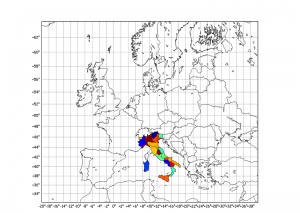
The goal:
The data:
http://www.gadm.org/ saved inside a new “borders/” folder !
The idea:
Opening a GADM shapefile, get region names, and plot filled regions with random color !
The process:
Copy and extend the readshapefile method from basemap, using the full power of shapelib.
From this example, you could easily check for region names, and plot specific colours for them and not randomly like I do !
The code is after this break:
#
# BaseMap example by geophysique.be
# tutorial 07

import numpy as np
import matplotlib.pyplot as plt
from mpl_toolkits.basemap import Basemap

### PARAMETERS FOR MATPLOTLIB :
import matplotlib as mpl
mpl.rcParams['font.size'] = 10.
mpl.rcParams['font.family'] = 'Comic Sans MS'
mpl.rcParams['axes.labelsize'] = 8.
mpl.rcParams['xtick.labelsize'] = 6.
mpl.rcParams['ytick.labelsize'] = 6.

fig = plt.figure(figsize=(11.7,8.3))
#Custom adjust of the subplots
plt.subplots_adjust(left=0.05,right=0.95,top=0.90,bottom=0.05,wspace=0.15,hspace=0.05)
ax = plt.subplot(111)
#Let's create a basemap of Europe
x1 = -20.
x2 = 40.
y1 = 32.
y2 = 64.

m = Basemap(resolution='i',projection='merc', llcrnrlat=y1,urcrnrlat=y2,llcrnrlon=x1,urcrnrlon=x2,lat_ts=(x1+x2)/2)
m.drawcountries(linewidth=0.5)
m.drawcoastlines(linewidth=0.5)
m.drawparallels(np.arange(y1,y2,2.),labels=[1,0,0,0],color='black',dashes=[1,0],labelstyle='+/-',linewidth=0.2) # draw parallels
m.drawmeridians(np.arange(x1,x2,2.),labels=[0,0,0,1],color='black',dashes=[1,0],labelstyle='+/-',linewidth=0.2) # draw meridians

from shapelib import ShapeFile
import dbflib
from matplotlib.collections import LineCollection
from matplotlib import cm

shp = ShapeFile(r"borders\ita_adm1")
dbf = dbflib.open(r"borders\ita_adm1")

for npoly in range(shp.info()[0]):
    shpsegs = []
    shpinfo = []

    shp_object = shp.read_object(npoly)
    verts = shp_object.vertices()
    rings = len(verts)
    for ring in range(rings):
        lons, lats = zip(*verts[ring])
        if max(lons) > 721. or min(lons) < -721. or max(lats) > 91. or min(lats) < -91:
            raise ValueError,msg
        x, y = m(lons, lats)
        shpsegs.append(zip(x,y))
        if ring == 0:
            shapedict = dbf.read_record(npoly)
        name = shapedict["NAME_1"]
        # add information about ring number to dictionary.
        shapedict['RINGNUM'] = ring+1
        shapedict['SHAPENUM'] = npoly+1
        shpinfo.append(shapedict)
    print name
    lines = LineCollection(shpsegs,antialiaseds=(1,))
    lines.set_facecolors(cm.jet(np.random.rand(1)))
    lines.set_edgecolors('k')
    lines.set_linewidth(0.3)
    ax.add_collection(lines)

plt.savefig('tutorial07.png',dpi=300)
plt.show()


I really like this – thanks. I’m playing around with this and would like to include a colorbar as well but I keep getting errors. Not sure what I should be doing in this case.
Hi Gavin,
Indeed, it’s not that easy to add a colorbar on this… For a side project, I had a dict with zip_codes and values (let’s say population). Then, line 63 becomes “lines.set_facecolors(cm.jet(pop/max_pop))”.
To add a colorbar, I think you’ll need to plot a scatter of the ‘lon, lat, c=pop’ somewhere (with alpha=0 maybe) before calling colorbar …
There must be a better way !
Ah, so it is as complicated as I’m experiencing. I’m also trying to get this to do a “live” plot on a Django server. Any ideas on where I should put the shapefiles to ensure they load properly?
Incidentally, given all the difficulties of differing country-name spellings, I found a shapefile with country ISO codes which makes things easier. http://thematicmapping.org/downloads/world_borders.php
I would suggest inputting the absolute path of your shapefiles in the method, (/home/gavin/my_shape_files/ .e.g.), so any place should work fine.
Thanks for the hint on the ISO shapefile !
Keep me updated of your progress !
Will do… thanks….
Apologies, actually solved this a week ago. It is relatively straightforward. Create a subplot, then create a standalone colorbar using the same colormap. Pass the upper and lower bound from your data to the bar and …
# [left, bottom, width, height]
ax2 = fig.add_axes([0.9,0.1,0.014,0.8])
cmap = cm.hot
# where bot is the lower bound and top is the upper bound from the original plot
norm = mpl.colors.Normalize(vmin=bot, vmax=top)
cb = mpl.colorbar.ColorbarBase(ax2, cmap=cmap, norm=norm, orientation=’vertical’)
# Set the font size for the axis labels
for t in cb.ax.get_yticklabels():
t.set_fontsize(8)
bbox_props = dict(boxstyle=”round”, fc=”w”, ec=”0.5″, alpha=0.8)
ax.text(0.5, 0, leader, ha=”center”, va=”center”, size=8,bbox=bbox_props,transform=ax.transAxes)
Your tutorials have been very helpful. Thank you.
I have a question concerning shapefile areas. How would you put the name of the area inside the defined area? Using your above code, how would you put ‘name’ inside the area it references?
Hey !
Thanks for the comment !
taking the mean coordinates from shpsegs and then calling plt.text(x,y,name) should work.
It might not be easy to handle overlapping texts…
Hi Thomas!
Thanks for your helpful tutorials.
What about plotting with plt.pcolormesh extended from scatter plot or other method? Sorry for repeatingly asking this question, I sent you through email couple of weeks ago.
“Opening a GADM shapefile, get region names, and plot filled regions with plt.pcolormesh !”
Thanks!
—
luq
good, but the library used to read shapefiles is a little outdated… Since then, Frank Warmerdam develop GDAL/OGR with Python bindings (http://pypi.python.org/pypi/GDAL/) and Joel Lawhead propose a pure Python librarie (http://geospatialpython.com/2010/11/introducing-python-shapefile-library.html and http://code.google.com/p/pyshp/) . See also, in french, http://www.portailsig.org/content/python-et-les-shapefiles and http://www.portailsig.org/content/python-et-les-shapefiles-suite-ou-le-module-le-plus-simple-utiliser)
with shapefile of Joel Lawhead, for example :
import shapefile
r = shapefile.Reader(r”borders\ita_adm1″)
shapes = r.shapes()
for npoly in range(len(shapes)):
long,lats = zip(*[shapes[npoly].points[i] for i in range(len(shapes[npoly].points)) ])
….
Hi!
I’m actually trying to do it with Joel Lawhead’s shapefile – shapelib isn’t going to work after all ..
Can you help me out, exept for that code from martin? What I got, is mainly:
fig = plt.figure(figsize=(15,7))
plt.subplots_adjust(left=0.05,right=0.95,top=0.90,bottom=0.05,wspace=0.15,hspace=0.05)
ax = plt.subplot(111)
x1 = -180.
x2 = 180.
y1 = -70.
y2 = 80.
m = Basemap(resolution=’h’,projection=’merc’, llcrnrlat=y1,urcrnrlat=y2,llcrnrlon=x1,urcrnrlon=x2,lat_ts=(x1+x2)/2)
m.drawcountries(linewidth=0.5)
m.drawcoastlines(linewidth=0.5)
shpath = ‘TM_WORLD_BORDERS/TM_WORLD_BORDERS’
r = shapefile.Reader(shpath)
shapes = r.shapes()
for npoly in range(len(shapes)):
longs,lats = zip(*[shapes[npoly].points[i] for i in range(len(shapes[npoly].points)) ])
.. how shall I go on?
best,
hannes.
Hi all,
I receive the following error message after running the program without any modification. Any clues?
Traceback (most recent call last):
File “italian_borders.py”, line 38, in
shp = ShapeFile(r”borders\ita_adm1″)
File “/usr/local/lib/python2.7/dist-packages/shapelib.py”, line 44, in __init__
self.this = apply(shapelibc.new_ShapeFile,args)
IOError: new_ShapeFile failed
Exception AttributeError: “ShapeFile instance has no attribute ‘thisown'” in ignored
thanks,
fabio
Hi Fabio,
I saw that error when I had the wrong path for ita_adm1.shp. I corrected that and the script ran fine.
Cheers,
Charles
I was going through basemap. I tried plotting a random example map using the following code.
def main():
ax = plt.subplot(111)
map = Basemap(projection='merc',lon_0=0, resolution='l')
map.drawcoastlines()
map.drawmapboundary(fill_color='aqua')
map.fillcontinents(color='coral',lake_color='aqua')
date = datetime.utcnow()
CS=map.nightshade(date)
#plt.title('Day/Night Map for %s (UTC)' % date.strftime("%d %b %Y %H:%M:%S"))
plt.savefig("3.png")
I get a weird image like this.
http://imageshack.us/photo/my-images/824/64645610.png/
Please let know if it were possible to fix this. I need better quality image with at least 800×600. If thats not possible without loss of resolution, I will switch to something else.
Thanks.
Dear Jim,
I’d say you have to set the “resolution=h” (=high) when instanciating the Basemap. Then, as nightshades seem undefined for the southernmost part of the globe, set a ylim to (-70,70) or something like that ? Note you can also start by defining the size of the figure : plt.figure(figsize=(11.6,8.3)) = A4 and saving using dpi=300 to increase the quality of the plot (you’ll have a 300 DPI A4-sized plot).
Cheers,
Thomas